Common Mistakes to Avoid in Menu Design
Common Mistakes to Avoid in Menu Design
Introduction
Your restaurant menu is one of the most important tools for attracting customers and driving sales. However, many businesses make simple design mistakes that negatively impact customer experience and reduce profits.
A well-designed menu should be clear, attractive, and easy to use. In this article, we’ll highlight the most common menu design mistakes and how you can avoid them.
Why Good Menu Design Matters
A poorly designed menu can confuse customers, slow down ordering, and even reduce sales. On the other hand, a smart menu design:
- Improves customer experience
- Increases order value
- Builds brand identity
- Speeds up decision-making
Common Menu Design Mistakes to Avoid
1. Overcrowded Layout
One of the biggest mistakes is adding too much information. A cluttered menu overwhelms customers and makes it hard to choose.
Solution: Keep your layout clean with enough spacing and limited items per section.
2. Too Many Choices
Offering too many options can confuse customers and slow decision-making.
Solution: Focus on your best dishes and keep the menu concise.
3. Poor Readability
Using fancy or small fonts makes your menu difficult to read.
Solution: Choose simple, clear fonts with proper size and contrast.
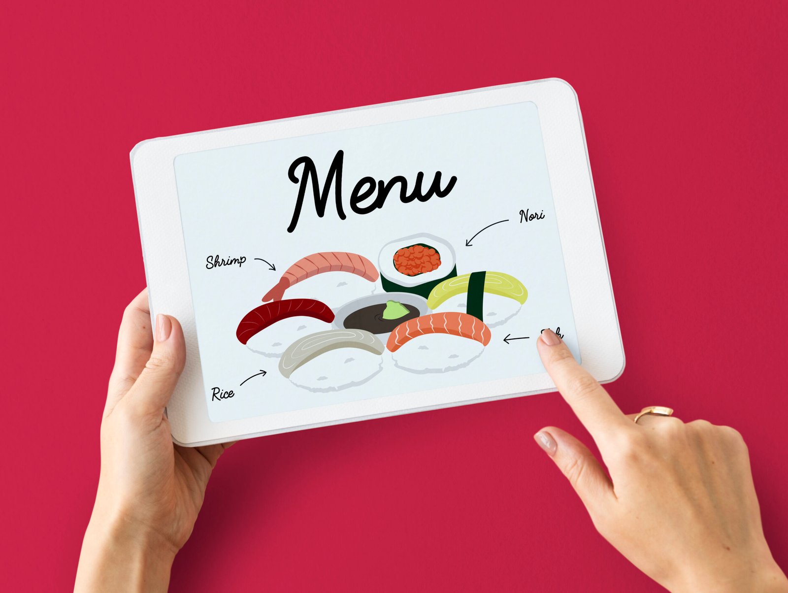
4. Lack of Clear Categories
If your menu isn’t properly organized, customers will struggle to find items.
Solution: Divide your menu into sections like starters, main course, and desserts.
5. Low-Quality Images
Blurry or unattractive images can reduce interest in your food.
Solution: Use high-quality, professional images—or avoid images if they are not good enough.
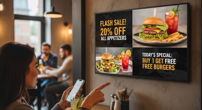
6. Ignoring Mobile Optimization
For digital menus, poor mobile design can frustrate users.
Solution: Ensure your menu is fully responsive and works smoothly on smartphones.
7. Confusing Pricing
Messy or unclear pricing can create frustration and reduce trust.
Solution: Keep pricing simple, aligned, and easy to understand.
8. No Highlight of Popular Items
If customers don’t know what’s best, they may struggle to decide.
Solution: Highlight best-selling or recommended dishes.
9. Inconsistent Branding
A menu that doesn’t match your brand can look unprofessional.
Solution: Use consistent colors, fonts, and logo across your menu.
10. Slow Loading Speed (Digital Menus)
A slow menu can drive customers away quickly.
Solution: Optimize images and design for fast performance.
11. Outdated Information
Incorrect prices or unavailable items create a bad experience.
Solution: Update your menu regularly with accurate information.
12. Lack of Descriptions
Items without descriptions may confuse customers.
Solution: Add short and clear descriptions for each dish.
Pro Tips for Better Menu Design
- Use whitespace effectively
- Keep design simple and clean
- Focus on customer convenience
- Test your menu with real users
- Continuously improve based on feedback
Conclusion
Avoiding these common menu design mistakes can make a huge difference in your restaurant’s success. A clean, well-organized, and user-friendly menu not only improves customer experience but also increases sales.
Take the time to review and improve your menu design—it’s an investment that pays off.